For my independent project I decided to continue on from
last year as I felt like I had a lot more angles to experiment with. I started
off doing a lot of research into different artists, after doing my research
project I had a lot more knowledge of ‘appropriation’ and realised how relevant
it was to my project. It occurs a lot with found photography as the images are
often used and recycled to portray a different meaning. I then researched a lot
more into found photography, and realised it was quite widely used for a
variety of reasons and wanted to continue using images I had found myself. This
is when I decided to search for negatives over the internet as I found it
interesting that with using negatives I wouldn’t know what I would be getting
and this could prove quite challenging. I ending up receiving film stills from
a couple of different movies, which was quite interesting as I was expecting
generic family, or travel images. At
first however this seem quite problematic as most of the images were well known
shots from popular films and I wanted to take the images out of their original
context. I did in the end chose two with
interesting contents and where not film specific. I wanted to make a piece in
response to Barbra Krugers work, however I wanted to highlight the fact that I
did not agree with the gender stereotypes that are shown a lot in the types of
films where my images came from. That’s why I layered an obvious stereotype in
text over the images and then manually stuck quotation marks over the top.
After these pieces I did more research and tried some more different angles of
layering words over images, firstly with found words and my own images, and
thirdly with my own words over my own images. Towards the end of my project I
started to research more into whether words or images can represent the real
life more accurately. However I only just touched on the surface. I think that
my project is still unfinished due to the large subject I chose, there where so
many avenues to go down I didn’t have enough time to experiment with them all
to finish with one final piece or outcome. But I do still think its interesting
enough to continue the project in the future. I think I have experimented
enough with found photography and hopefully will be moving on to using
different techniques such a Jenny Hozler inspired projection or larger scale
images covered in words. Over all I am happy with the work I have produced so
far, but have a lot more to investigate until I come to a solid conclusion. My favourite outcome was the experimentation
with my found negatives as I feel I had successfully got to grips with the use
of appropriation and discovered how photographs can be edited in ways to
completely change the image intentions and meanings.
Thursday, 28 March 2013

After researching into Alexander Honory's work of using words to represent pictures it started to get me thinking about which medium of representation is more truthful. Which is when I constructed this image. I decided to take the same concept but instead of removing the image altogether I wanted to integrate both ideas into one. I printed off loads of words and physically covered them over the object they were describing. This was my way of investigating what is more trustworthy the words or the images? Here I have not been too descriptive with my truth of words because it is only a basic background.


Thursday, 7 February 2013
Alexander Honory
Each photographic image holds a moment, a fraction of the past that holds and proves the existence of its author, the object within and the owner. By finding and re-presenting images like these artists like Alexander Honory are saving that moment in time and the memory from eternal destruction and symbolically restoring the presence of the people/objects within them. Where as Schmid takes a more physical approach to recycling images in order to help the environment, Honory uses a more 'spiritual' way to present his art. His method on re-producing the images he finds and reconstructing the meanings is through presentation. He uses enlargement, framing ect to highlight the human within the image, giving the common 'family photograph' individuality. He likes to respect his subjects and authors by not only bringing back the images but focusing on the entirety of the moment in which it was taken. For example in his work "Thirteen newlywed couples for Berlin", he projected giant wedding images in the town centre of Berlin to take a private intimate photograph and re-present it in the most public way possible. In the mid 90's he then started to question the significance of photography within family memories. He would write a description of what was missing out of the photograph and present the words in the gallery instead of the images, this work was called "The Lost Pictures". This work was widely open to interpretation, where Honory was actually portraying his disbelief in the power of photography. Controversially although he is a photographer, he struggles to believe that photography is able to describe what images really represent. This work reflects the pieces I made in the first year, layering words over the images questioning which medium best represents what happened at the time.


Finding words first


Wednesday, 6 February 2013
Ed Ruscha – Word Paintings
Ruscha is an American artist who worked with a variety of
medias including painting, printing, photography and illustration around the
Pop Art movement. His art training was
based around commercial photography which introduced his interest in typography
and using words within images. His first
works included oil paintings with comic writing layered over the top referring
to popular culture. He once spoke about
where his phases come from: “Well,
they just occur to me; sometimes people say them and I write down and then I
paint them. Sometimes I use a dictionary.” I find this really interesting, and
so far have worked using images first and then finding words to overlay them,
however I am now thinking about starting with words then finding images after
and see what a different effect this has on the work outcome. Ruscha has always
used different means to add words onto his images, for example pouring liquid
over a flat monochromatic surface, this is something I would have really liked
to have tried in my project, bringing in more of an ‘art’ factor into my work
however at this point it is not a path I could take with the time scale I have
but will hopefully something I can practice in the future. I also like the way
Ruscha makes connections to his words outside of his images, for example a
project in which he presented seven different words that rhymed, and in a
separate project he did a series of images with “dirty” and inviting phrases.
This sort of play on words it what attracted my attention to his works. However
there is an ongoing theme throughout his work, even if it is sometimes not so
obvious, Rushca is constantly asking questions about the impact urban life has
on society.


Friday, 1 February 2013
Reusing images
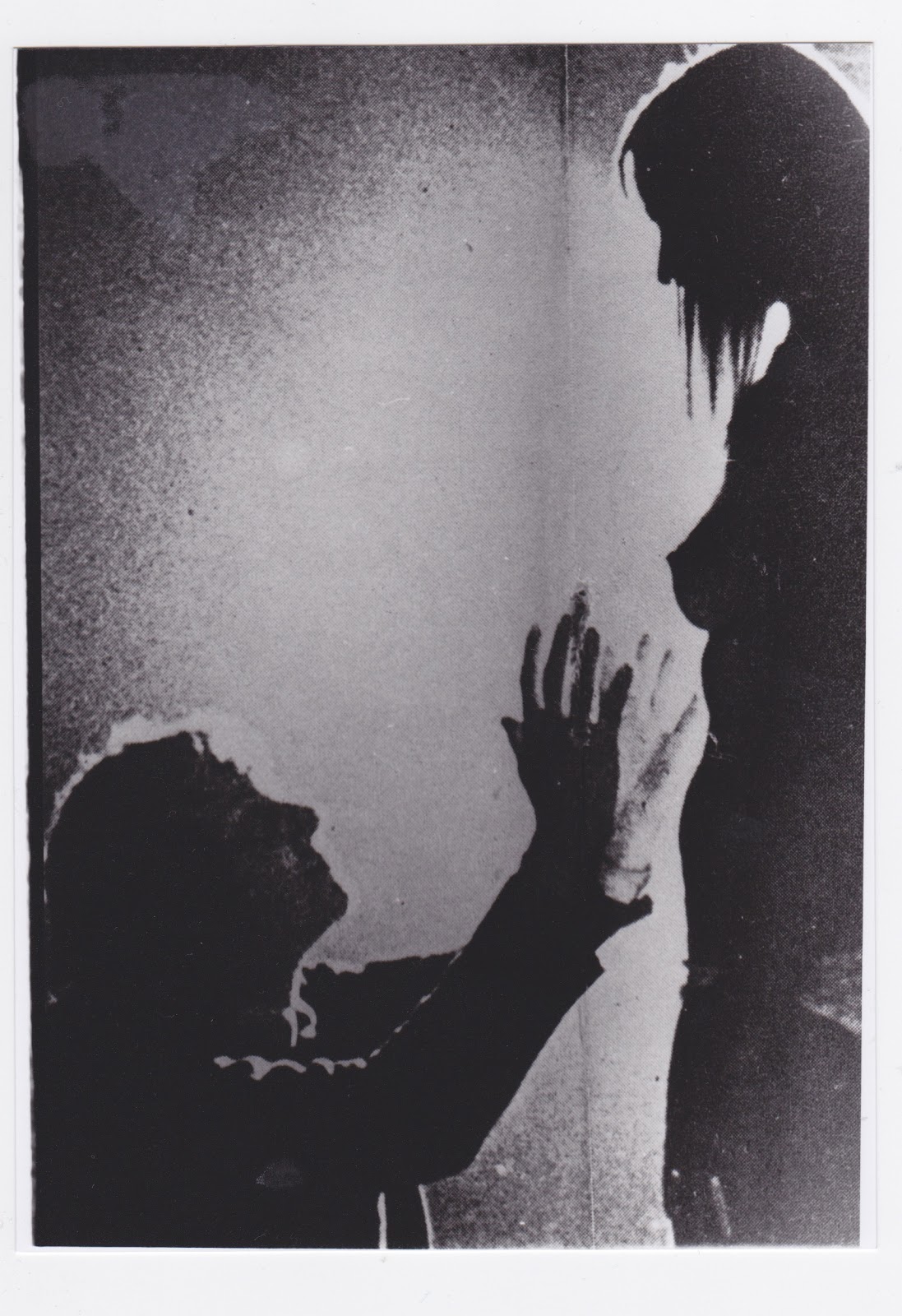
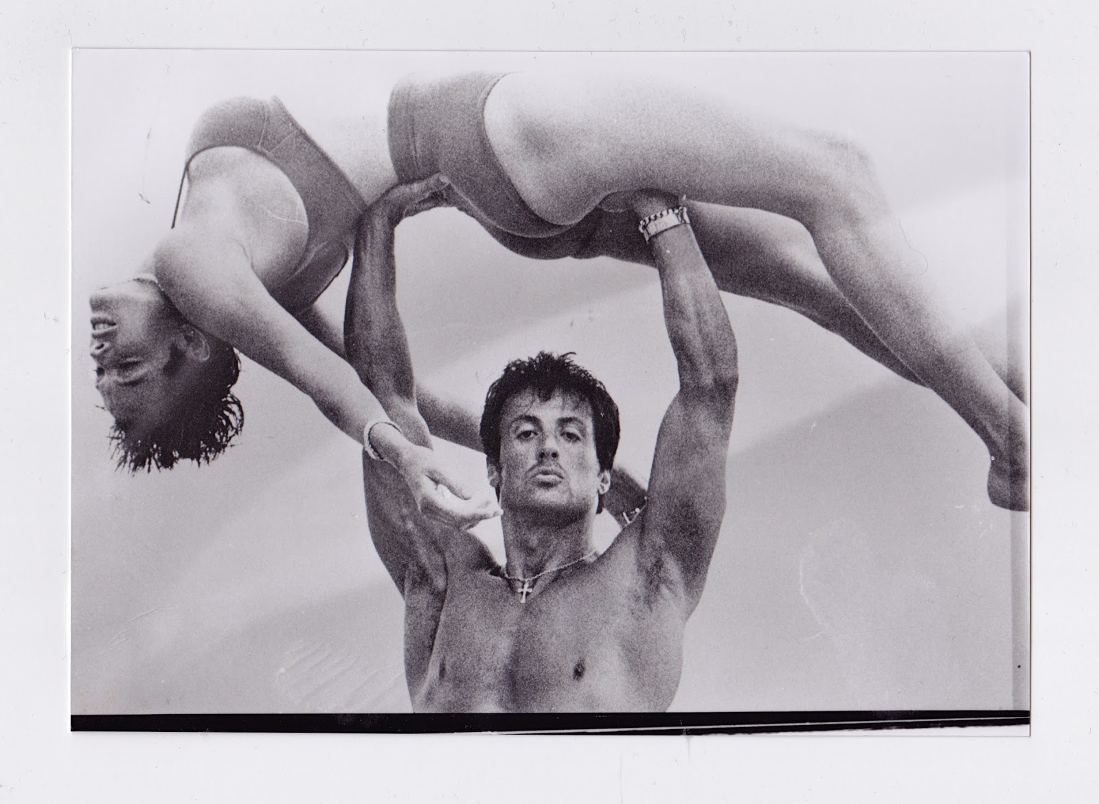
Next I wanted to add words to my found images in the style of Kruger. Out of the negatives I chose these two images because they contradict each other, portraying the male gender of both weak and strong. Looking through Krugers work I have seen that she emphasises these stereotypes. However I wanted to make fun of them, trying to portray the point that not all men are physically strong or mentally week. This is why I used the language "man strong" and "man weak", because grammatically it makes no sense, therefore mocking the meaning. To emphasise my point I also used quotation marks to show that they are not my personal opinions but those of socialists such as Kruger. I also used paper on top or a darkroom print and brown tape to stick it down to experiment with how montage would look. Technically when enlarging the prints in the dark room I did have to do a bit of dodging and burning on both images, however because of the poor quality on the negatives or the original photograph that was taken the quality of the prints were not 'technically' pleasing. However from the beginning I said that because I had no control over the negatives themselves, the image quality out come wasn't important, making it conceptual.


Thursday, 31 January 2013
Friday, 25 January 2013

Sunday, 20 January 2013
Finding Images
I decided I wanted to used found photography for my work. I chose to look for negatives as I liked the idea of not knowing what I was getting until properly enlarging in the darkroom. I decided to look on a bidding website - ebay. I had no idea what I would find or even if anyone would be selling of photographs at all. It was quite hard to find a set of negatives that had no description and were not extremely expensive but in the end I ordered some old-looking black and which 35mm. I liked the excitement of having no idea what was on them, although ultimately I was taking a risk as they could have been awful quality, over exposed, under exposed or completely blank. However when I opened them I found out I had purchased what seemed to be film stills from A Clockwork Orange. I enlarged some of the images and soon will be looking into how I can present them in a way to completely take them out of set their context.


Thursday, 17 January 2013
Vernacular and Found Photography
Vernacular photography is a term used to describe images normally taken by amateur or unknown photographers of everyday life including snapshots, family portraits, holiday photographs ect. However Vernacular photography has now started to integrate vastly into the public eye in new art forms. Photographers such as Joachim Schmid have used different ways of gathering an archive of found photographs and re-presenting them as their own work or, in his own words, "I'm using photographic garbage and turning it into art". This notion came about after artists started insisting there are already too many photographs in the world and there is less of a need to create more. When collecting found images like these however we take away the traditional notion of 'authorship'. Like many of these photographers do, when collection images from places such as a flee market they have just the bare material of the image to work with; there is no sign of a typical 'author' nor any information of the subject.
This leaves us as viewers to construct our own narratives without the constraint of having a fixed knowledge of the photographer, in other words it is open to any kind of interpretation, where as the majority oh artists normally hold an intention behind their work. This also highlights the power that these kinds of images that surround us in everyday life, even without a context we can now view them as 'art'.
It is said that Vernacular photography holds honesty and purity that other forms of photography now lack. In this case we can compare it photojournalism, which is meant to portray and share truth yet it seems to be very structured and in some cases staged. Where as found photography that has documented something in the past as, for example, a snap shot has no intention of being in the public eye, therefore no intention of lying or being mis-leading.
Recently Vernacular and Found photography has grown in popularity and has become somewhat of a 'trend' in the art world and is starting to overtake visual culture. This may be because as 'authored' photography is seems to be controlled by sales, galleries and collectors, 'found photography' somewhat defies commercialisation by having the recycled and historic effect.
Evidence of this can also be seen now in print. In 1994 a magazine was published named FOUND. It is a collection of donated submissions by its readers. It not only includes images but also personal belongings such as love letters, birthday cards, tickets, poetry ect. Another magazine similar to FOUND is Useful Photography, published later in the 90's it includes not only Vernacular images but photographs from print, catalogues, porn, and in general most forms of photography. There are now also websites available that have large catalogues of found images, some which pre-date 1950s. These sights include: http://look-at-me.tumblr.com http://timetales.ddfp.nl/index.htm http://www.objectnotfound.net/photos .
The interesting question that found photography raises is: Who does know what lies beyond the images? This brings us to the ethics of found photography. When you are reproducing existing images there is always a question of copy right and ownership issues. This is similar to found photography, where in some cases when unknown photographers have sold bundles of their old family photos they have given up the right of ownership however there is an ethical issue of privacy involved. Is it disrespectful to publish a persons private life without their knowledge? In some cases where the photographer has come forward a disclaimer is issued however if the photographer remains unaware is it irresponsibly invading into their privacy? This is one of the reasons Joachim Schmid founded the 'Institute for the reprocessing of old photographs' where owners would donate their images, knowing what they would be used for.
When first creating this institute Schmid advertised his scheme by telling people "the chemicals contained in all photographs pose enormous dangers to our health. What‘s more, photographs in such quantities increase visual pollution and undermine our thinking power" while he may be exaggerating a little when it comes to "damaging our health", I do agree with his point that we should start recycling more photographs when we can.
Saturday, 29 December 2012
Perfume adverts are well known for using famous actresses and beautiful models. Many adverts on the tv and print have connotations of sex and use generic representations of woman and men. The adverts use these to try and persuade the customer that when they buy their perfume they will conform to the stereotypes of 'beautiful woman' or 'masculinity'. Its this sort of media which invited children and teenagers to judge at an early age whether or not someone is 'normal looking'. Bellow are a few images I have found and added text to change the meaning.


Saturday, 15 December 2012
Appropriation and Kruger
Appropriation means to place an object or image in a context with which it is not conventionally associated with, forcing the audience to create its own interpretation. The text appropriates (takes over) the image. Barbra Kruger uses appropriation by embracing both image and language commonly used in advertising to convey a different message.
For example, in 'Your comfort is my silence', 1981, Kruger combined a black and white image of a man pushing his finger up to his lips insinuating silence with 'your comfort is my silence' text. The first two words cover the mans eyes in order to remove identity and portray the idea of 'all men are the same'. By arranging the text in an advert-like collage format to convey a message of gender stereo types, Kruger's image becomes a work of appropriation. However at the same time she is keeping her statements somewhat ambiguous, forcing the viewer to construct meaning and actively participate themselves in the appropriation process of the work.
Appropriation is also used in the way Kruger's work was distributed: in the form of umbrellas, tote bags, postcards, mugs, T-shirts, posters, and so on, purposely confusing the boundaries between art and advertising. Most of the images Kruger uses for these works are found photography taken from American print media, she was using images to mock its their own sources.


Sunday, 2 December 2012
Jenny Holzer
Jenny Holzer is a conceptual artist who lives and works in New York. I first came across her work after reading she had studied with Barbra Kruger and immediately became interested. Holzer is mostly known for her large public displays on billboards, buildings and even landscapes. She uses projection of words to present her views on feminism and society. As well as this she uses a large array of media to present her ideas and statements such as signs, benches, stickers, t-shirts, paintings, sound, light, video ect. Her large scale projections with statements such as ‘There is a fine line between information and propaganda' are intended to provoke public debate. She is also trying to break the boundaries of niche audiences within art, proving that her work can be seen by anyone, anywhere. She also integrates appropriation within her work using LED signs. The signs look like a form of advertising you would see in large cities, which is why she placed them in areas such as times square. However once read the audience can tell it is not an advertisement and questions the intention of the sign. It also points out how easy we can consume information through different media, we walk past advertisements, billboards and automatically read and consume the information and store it. It questions whether consumers today have any real control over the information that is provided to them. I find her work really inspiring as she uses words and presentation to create her art. I have so far added words on photoshop to create my images. I would like to explore and experiment using other means such a projection and possibly in the dark room.


Saturday, 1 December 2012
Year 2
Last year for my independent project I looked at how words can affect images and how words used in images can create a whole new piece of art. I added words to old, boring found images to make them more interesting and meaningful. This year I think I will continue to use found photography and possibly explore ways in which I could change the artists intention. I will start by returning to look at Barbra Kruger's work and investigating her use of appropriation to portray her views. I then hope to gather a collection of used images myself to work with as I really like the idea of recycling images as there are too many in the world. Last year I used old family-taken photographs. This year I intend to dig deeper and find old photographers images and hidden treasures.
Wednesday, 23 May 2012
Evaluation
This is the project I found the most challenging. I chose to do word and image because I was really interested how language can change the meaning of photography. I started off with an ideas board on different ways images and text are used together. This was helpful at the beginning but did not feed me as many ideas as I hoped. I went straight into researching John Baldessari the conceptual artist. I really liked his work, how he likes to challenge the typical generic conventions of a photograph. I did try attempting some “wrong” images but to me they all came up too cliché and I didn’t think they were good enough to keep or post on my blog. I then looked at Barbra Kruger’s work, still with no image ideas for myself. I wrote about how she is mimicking adverts and writes a lot about society and feminism. But the thing I liked the most was how the meaning of the images were changed when the text was added, without the text it would be a normal, non-critical photograph. At this point in the project I was really stuck for ideas, but got really interested in conceptual art. I started cutting and pasting with magazines and newspapers, but because I don’t have any strong political views I was stuck as to what message I wanted to put across. I settled on just the one about beauty and power, trying to reflect how a lot of the time things come easier to those who are stereotypically better looking than others. After a tutorial I was instructed to look at found photography as I was completely stuck for ideas to photograph myself. So with conceptual art in mind I started playing around with words in front of an image, bringing out a fun and cheeky to my practice almost comical. Then I started looking deeply into Joachim Schmid work and liked how he uses so many different techniques and practices to present found photographs. Especially his QR code it really intrigued me to know why and how. My last selection of images consists of words overlaid onto photographs describing what is there in relation to the lay out of the image. I think my project has been very research and contextual based, it was mostly about me widening my knowledge of art history and conceptual art practitioners. There are a few starting points I wish to continue on next year, but so far this project has not come to an end. I think the main lows point in my project is my lack of outcomes. Looking back I think this is because I was over thinking and, from my point of view, not producing anything worth presenting. For the majority of the project I had a creative block, and only until the last couple of weeks did I have ideas I could expand on, I need to remember in the future go out and try to get inspired, instead of sitting in doors worrying about it and wasting time producing rubbish. If I was to continue this project next year I would look more into words, images in relation to new technology (such as QR codes) and also research deeper into conceptual art and photographers.
Tuesday, 1 May 2012


Monday, 16 April 2012
A Picture Paints 1000 words...
Developing my idea from taking out elements of an image and replacing it with words, I decide to take 2 photographs and replace the whole thing with words. The way I did this was just listing words in the position they are in the image.I then overlaid the text and image on photoshop but didn't really like the outcome.


Friday, 9 March 2012
Joseph Kosuth


Tuesday, 21 February 2012
Rene Magritte
This image is a painting by German surrealist artist Rene Magritte. It’s a painting of a pipe, with the caption “Ceci N’est Pas Une Pipe”, French for “this is not a pipe”. She is trying to be clever and use text to state the obvious, somewhat being flippant and cheeky. The pipe is not a pipe, but a painting of a pipe, there is not a physical pipe in front of you, therefore it is not a pipe. This is just a playful way to include text in an image, were as lots of images anchored by text is reflecting political and social views.
 My response to 'This is not a pipe'. Its a photograph of a landscape, an image I have taken myself but now anchored with the text "This is not a landscape, it is only dots". The dots are referring to pixels. The image is not a landscape, and while on the screen it is not even a physical photograph, but thousands of miniature dots making up an on-screen image. I liked this original idea but thought the image came across a little cliche, so decided not to peruse it.


Wednesday, 1 February 2012
Joachim Schmid
There are millions of photographs being produced around the world every day; most of them have no second thought towards them, useless snapshots that’s added to the uncountable number of images in the world’s print/online libraries. Each one is contributing to using paper, chemicals, storage and ultimately visual pollution. This is the view of photographer, Joachim Schmid.
Joachim Schmid is a German based photographer who has been working with used photography since the early 1980s. At first he would purchase large amounts of used photographs and public images in flee markets that became his body of work. It was his awareness of consumerism and recycling that drove him to start collecting used art as well as his passion for photographic history. In 1990 he started a group called Reprocessing of Used Photographs, where he would ask people to send in old photographs instead of throwing them out, where they could be analyzed and deemed useful or worthless, in which case they would be disposed of in an environmentally friendly manner.
He uses the photographs in a large variety of ways from merging two or more different images together to tearing up and repositioning segments of photographs as well as simply just arranging a group of images and presenting them in different ways.
 Heres an image i found that had already been cut out. I found it interesting because its a family photograph that was found in my house, yet no one can recall who was sitting there and why they where taken out. This is what I like about found photography, each image has an unknown history and all the audience can do is speculate. I inserted the question mark myself keeping it within the text & image project.
 NINE ERRORS
A recent project named Nine Errors takes a step into the modern world of technology and smart phones. When I came across this I found it without a doubt the most interesting/diverse form or photography I have ever seen. It starts with a QR code, a barcode that can only be scanned and recognized by smart phones. Schmid created these codes and publically posted them around the world in cities such as Berlin, Paris, Rome, New York, London, Amsterdam ect. Once the public scan the code on their phone they would be taken to his online exhibition. Except unknowing to his audience his work was a selection of images of words and phrases. When a QR was scanned it would take you to one of nine ‘errors’. For example: “404 error: file not found” was what came up on my phone when I scanned one of his codes. Confusing the audience to think that the link was broken, when really they were looking at his work.
Now with this project can arise debate on whether its classed as 'art' or even photography. But if you break it down, in actual fact you can to take a picture of the QR in order to open it, and the error codes are actually images of words. Making it a form of photography.
NINE ERRORS
A recent project named Nine Errors takes a step into the modern world of technology and smart phones. When I came across this I found it without a doubt the most interesting/diverse form or photography I have ever seen. It starts with a QR code, a barcode that can only be scanned and recognized by smart phones. Schmid created these codes and publically posted them around the world in cities such as Berlin, Paris, Rome, New York, London, Amsterdam ect. Once the public scan the code on their phone they would be taken to his online exhibition. Except unknowing to his audience his work was a selection of images of words and phrases. When a QR was scanned it would take you to one of nine ‘errors’. For example: “404 error: file not found” was what came up on my phone when I scanned one of his codes. Confusing the audience to think that the link was broken, when really they were looking at his work.
Now with this project can arise debate on whether its classed as 'art' or even photography. But if you break it down, in actual fact you can to take a picture of the QR in order to open it, and the error codes are actually images of words. Making it a form of photography.


Subscribe to:
Posts (Atom)