
John Baldessari
Born 1931, Baldessari is a well-known American artist working with conceptual art and photography. He started off as a painter and didn’t focus on photography until the mid 1960s. In his work he integrated text to demonstrate the power of language and to push the boundaries of art.
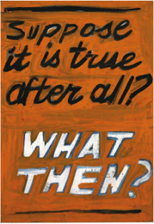
Baldessari’s early work consisted of blank canvases with hand painted statements such as: “Suppose it was true after all? WHAT THEN?” Baldessari then progressed to use commercial font instead of hand written forms in his work in order to emphasize the meaning more then the text itself.
We can see this theory works within these two examples of his work, where on top the purpose
of the image is almost hiding behind the colour, italic font and lowercase letters. On the bottom Baldessari’s plain background and bland lettering stands out and catches the eye of the audience. These paintings are a response to the critical feedback of his paintings being a “private language” so Baldessari used plain text and photography to make his statements more clear.
In 1967 John Baldessari exhibited his ‘wrong’ series. He uses a selection of photographic images anchored by text. The most famous of which titled ‘wrong’ shows an image with poor composition juxtaposed by the text ‘wrong’ bellow the photograph. This image references a chapter on composition in a photography techniques book.

The irony of the word is what makes the image so appealing, just blatant judgement of the photograph. The message that Baldessari was trying to say in the image is why should we conform to conventional aspects of art or photograph, why does our work have to be judged? The interesting fact is that an idea cannot be wrong or right as it is executed as a personal response. John Baldessari once stated: "You don't want anyone to say 'You can't do that!' But you do get a lot of that in New York. One of the healthiest things about California is - 'Why not?'”
Balderssari's conceptual art approach consists of photographs with peoples faces blanked out by blocks of colour. He has removed the detail and important parts of the images to emphasise his statement with pop art influences.

No comments:
Post a Comment